Introduction
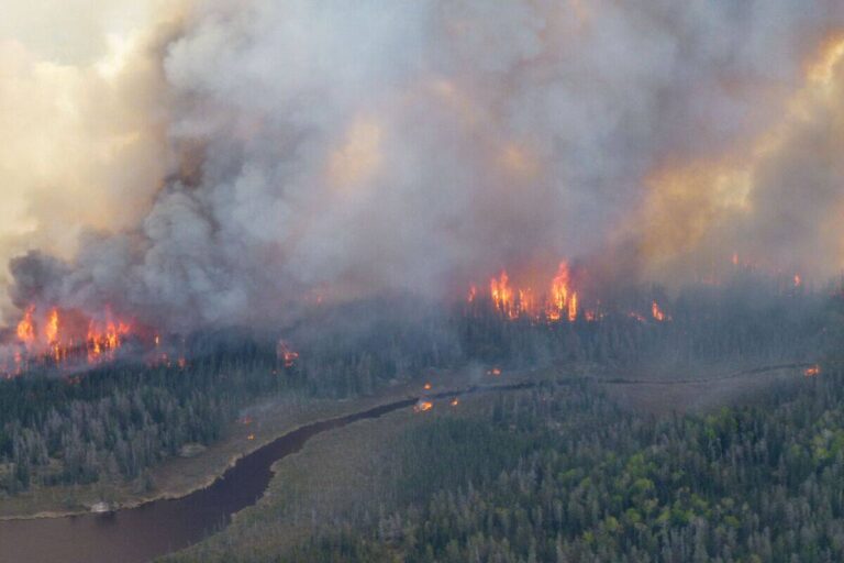
In recent years, Ontario has faced an increasing number of wildfires, significantly impacting air quality across the province. As smoke from these fires fills the air, it becomes crucial for residents to stay informed about the air quality in their areas, particularly for those with respiratory issues. The Smoke Map Ontario is an important resource for tracking smoke levels, providing timely information that can help individuals make informed decisions regarding outdoor activities and health precautions.
The Significance of the Smoke Map Ontario
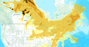
This interactive tool has been developed as part of Ontario’s environmental monitoring efforts. The smoke map shows real-time data on air quality across various regions of the province, identifying areas that are most affected by smoke pollution. It utilizes satellite imagery and ground-based observations to provide accurate assessments of air conditions.
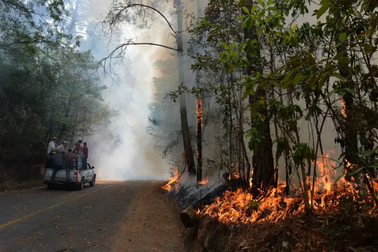
For residents, accessing the smoke map is vital, especially during wildfire season. With wildfires becoming more frequent due to climate change and dry conditions, having access to reliable air quality information can prevent health risks associated with smoke exposure, such as respiratory illnesses and cardiovascular issues. The smoke map not only informs residents but also assists local governments and health authorities in issuing advisories and warnings.
How the Smoke Map Works
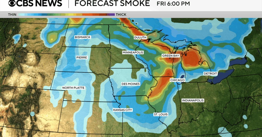
The Smoke Map Ontario operates using a color-coded system that indicates air quality levels across different regions. Areas marked in red signify unhealthy air quality where sensitive groups, including children, the elderly, and those with pre-existing health conditions, should avoid outdoor activities. Yellow zones indicate a moderate level of concern, while green zones signify good air quality.
The map is updated regularly, particularly during periods of high smoke concentration, making it a reliable source of information for both the public and local administrations. Users can access the map through various platforms, including government websites and mobile applications.
Recent Developments and Usage Trends
Recently, Ontario has seen a rise in the utilization of the smoke map, especially during peak wildfire events this summer. During June and July, which are often critical months for forest fires, the number of users accessing the smoke map spiked, reflecting a growing awareness regarding air quality. Public health campaigns across the province have urged residents to use this tool to stay informed and take necessary precautions.
Conclusion
The Smoke Map Ontario is more than just a tool for tracking air quality; it represents a crucial step toward understanding and managing the health implications of wildfire smoke. As climate change continues to affect our weather patterns, tools like the smoke map will play an increasingly vital role in protecting public health. Moving forward, residents are encouraged to familiarize themselves with the smoke map and remain vigilant during wildfire seasons, ensuring that they can make informed decisions about their health and safety.